Rocksauce v9
everything
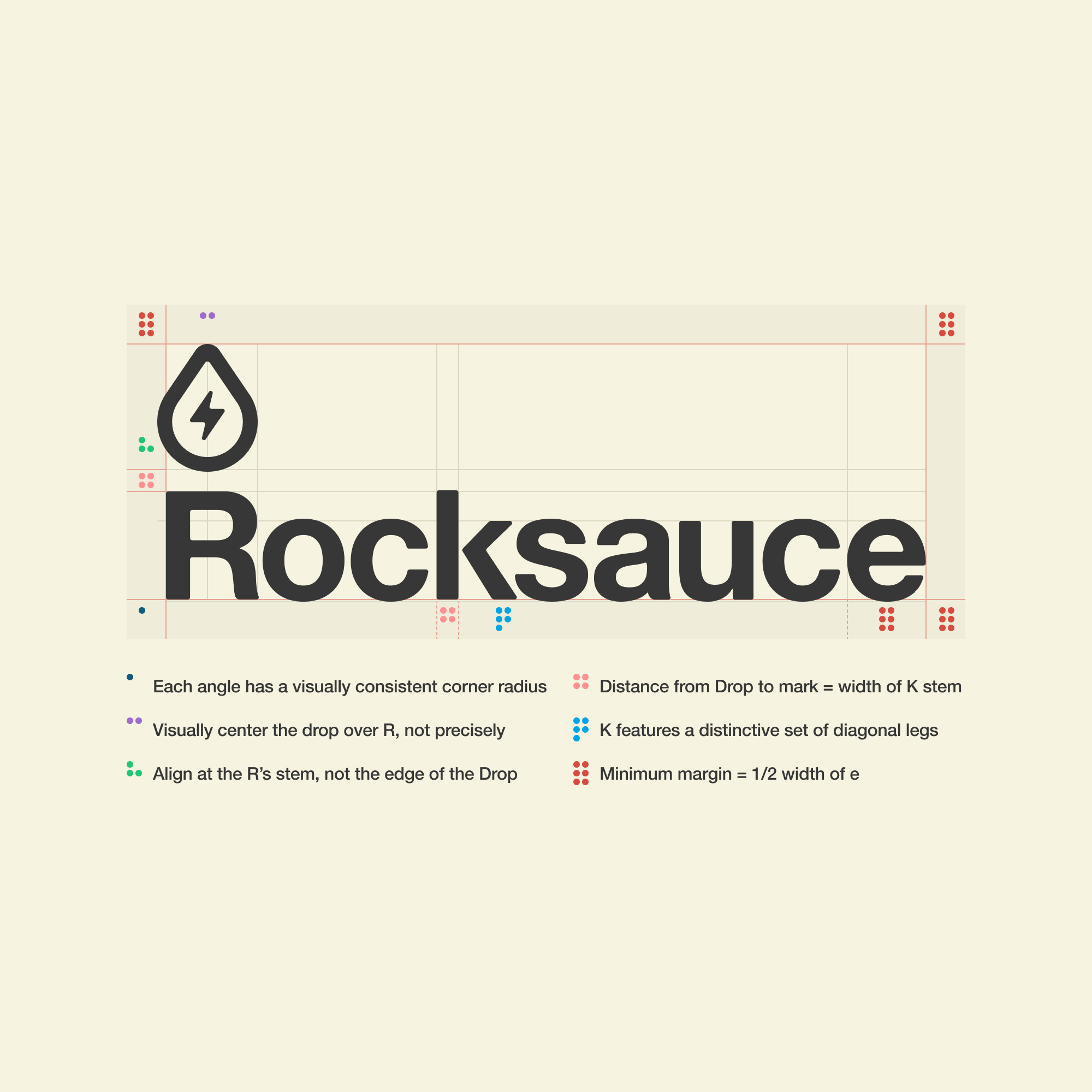
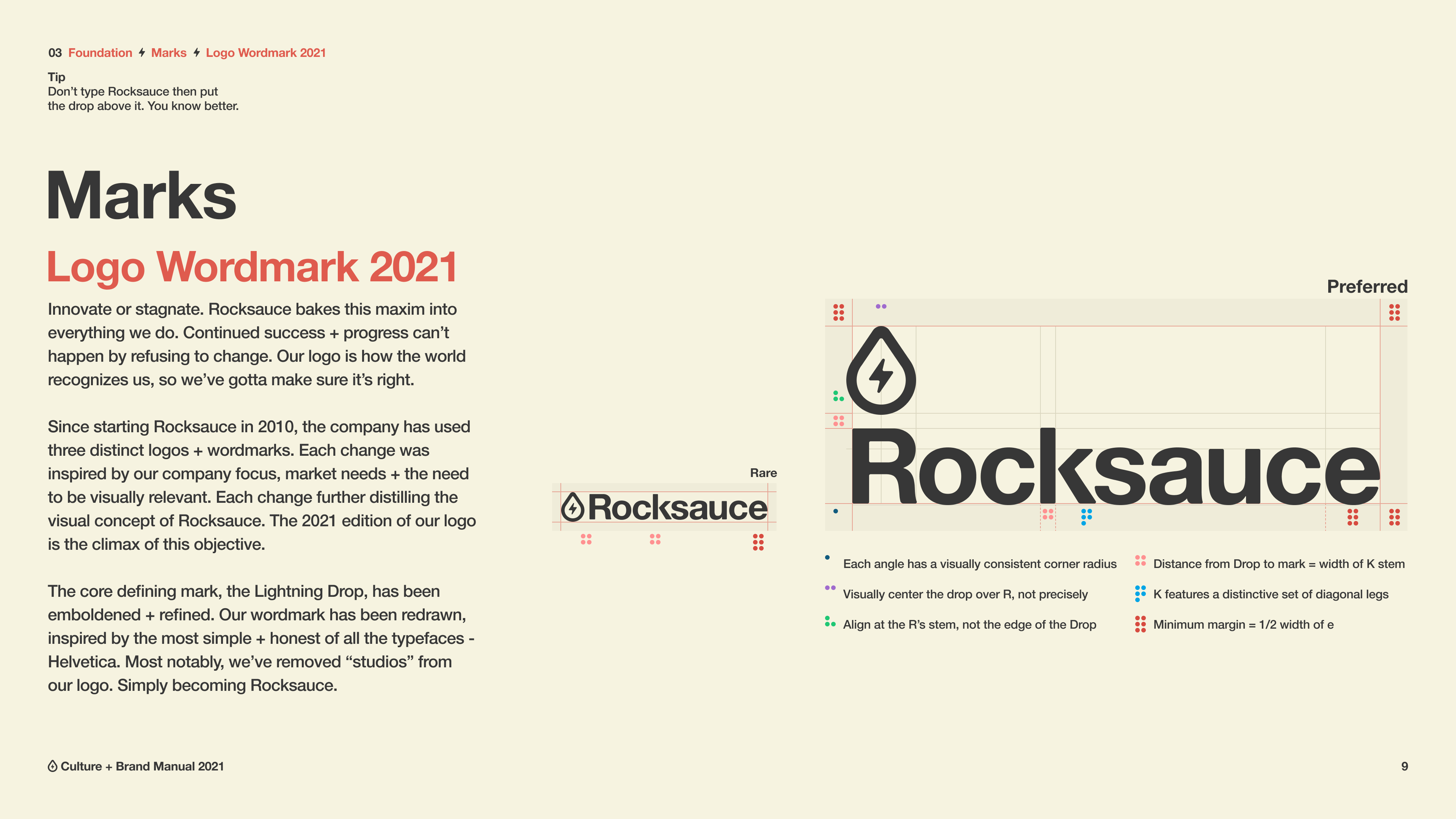
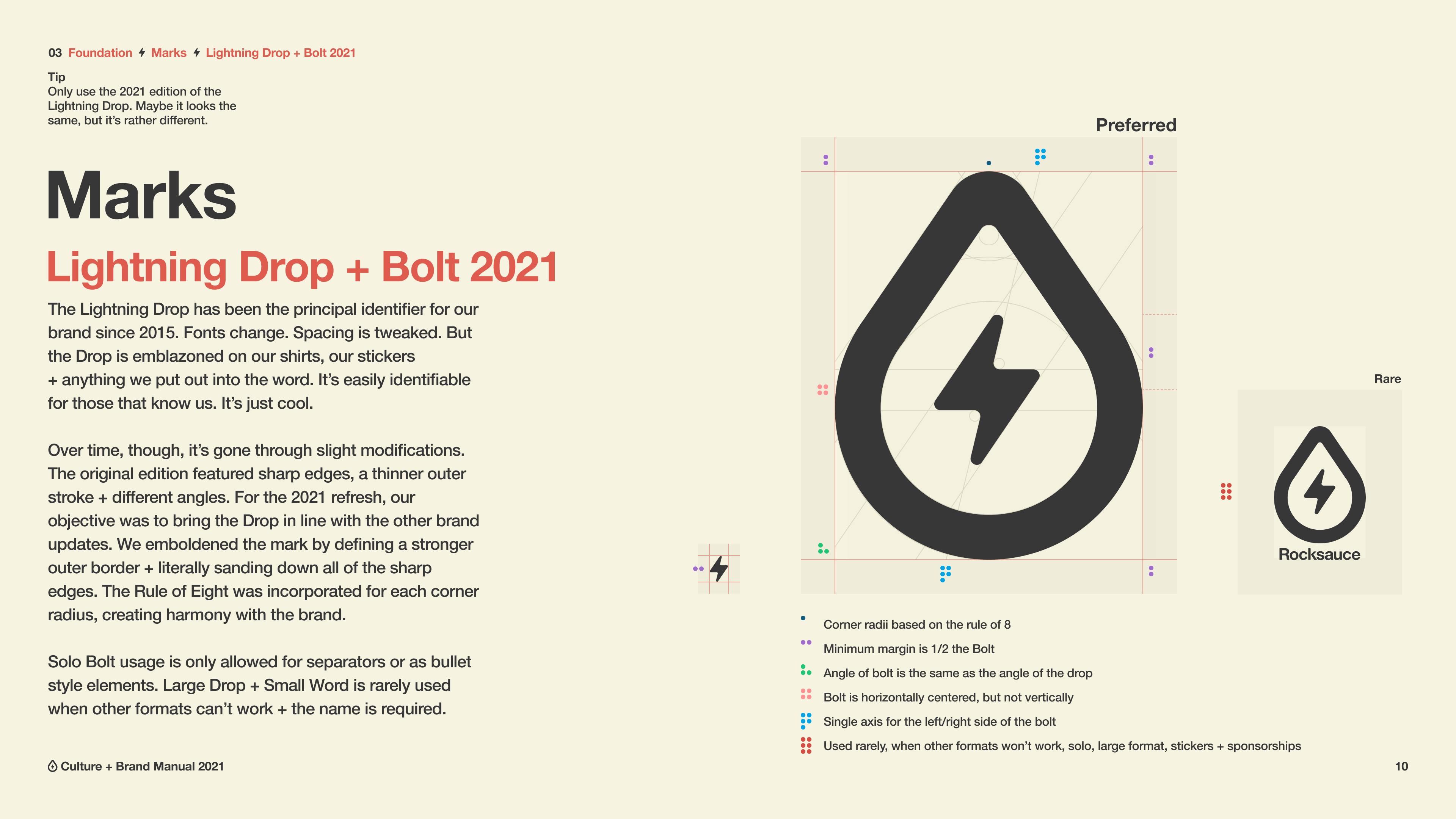
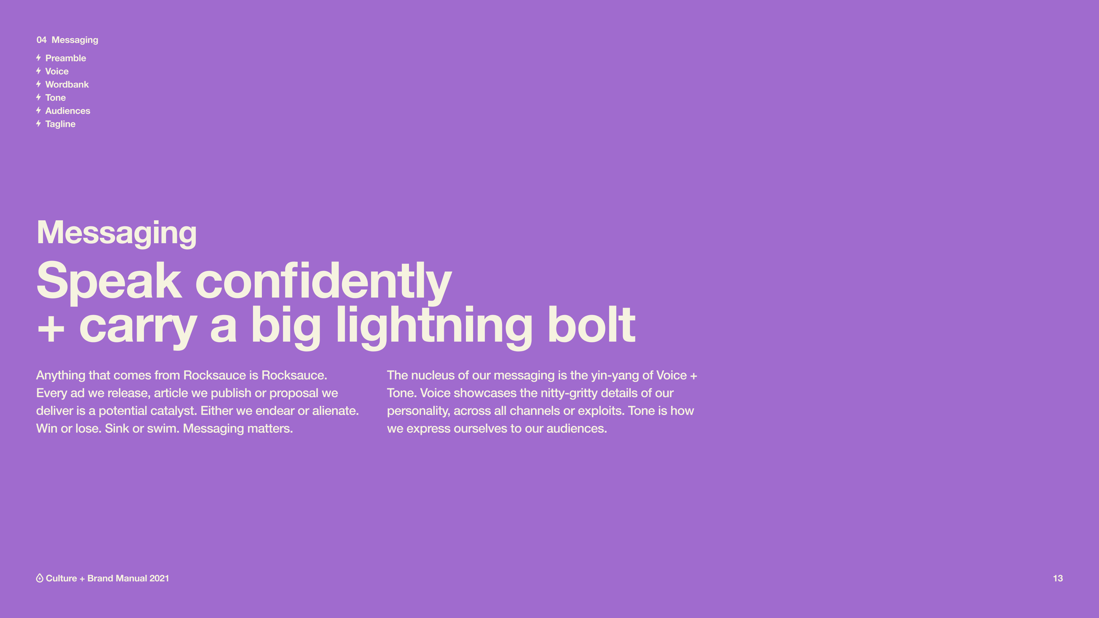
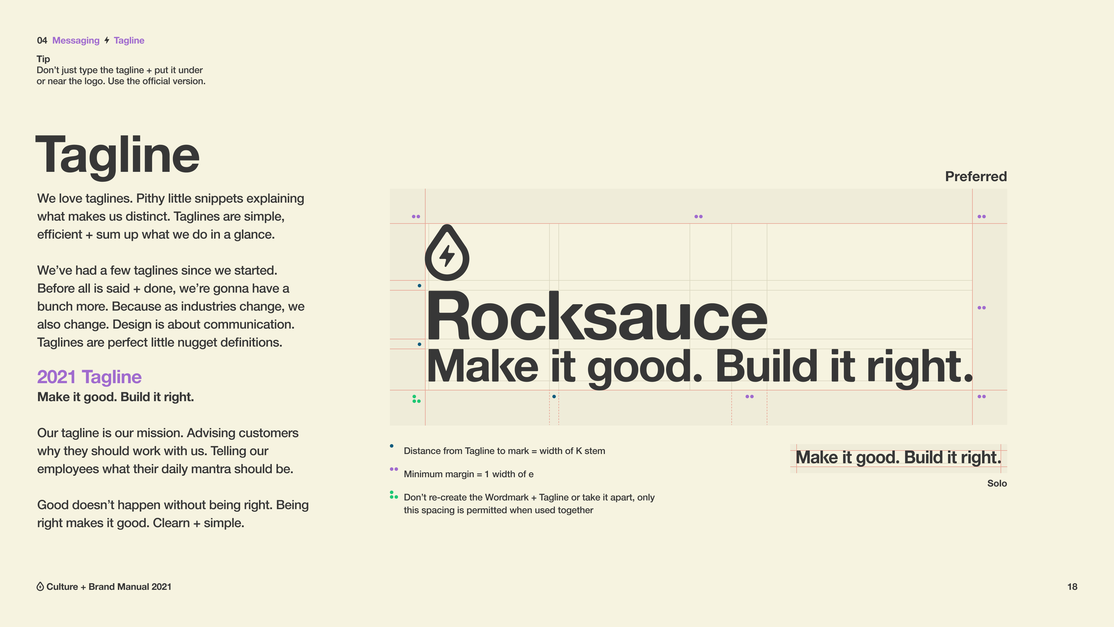
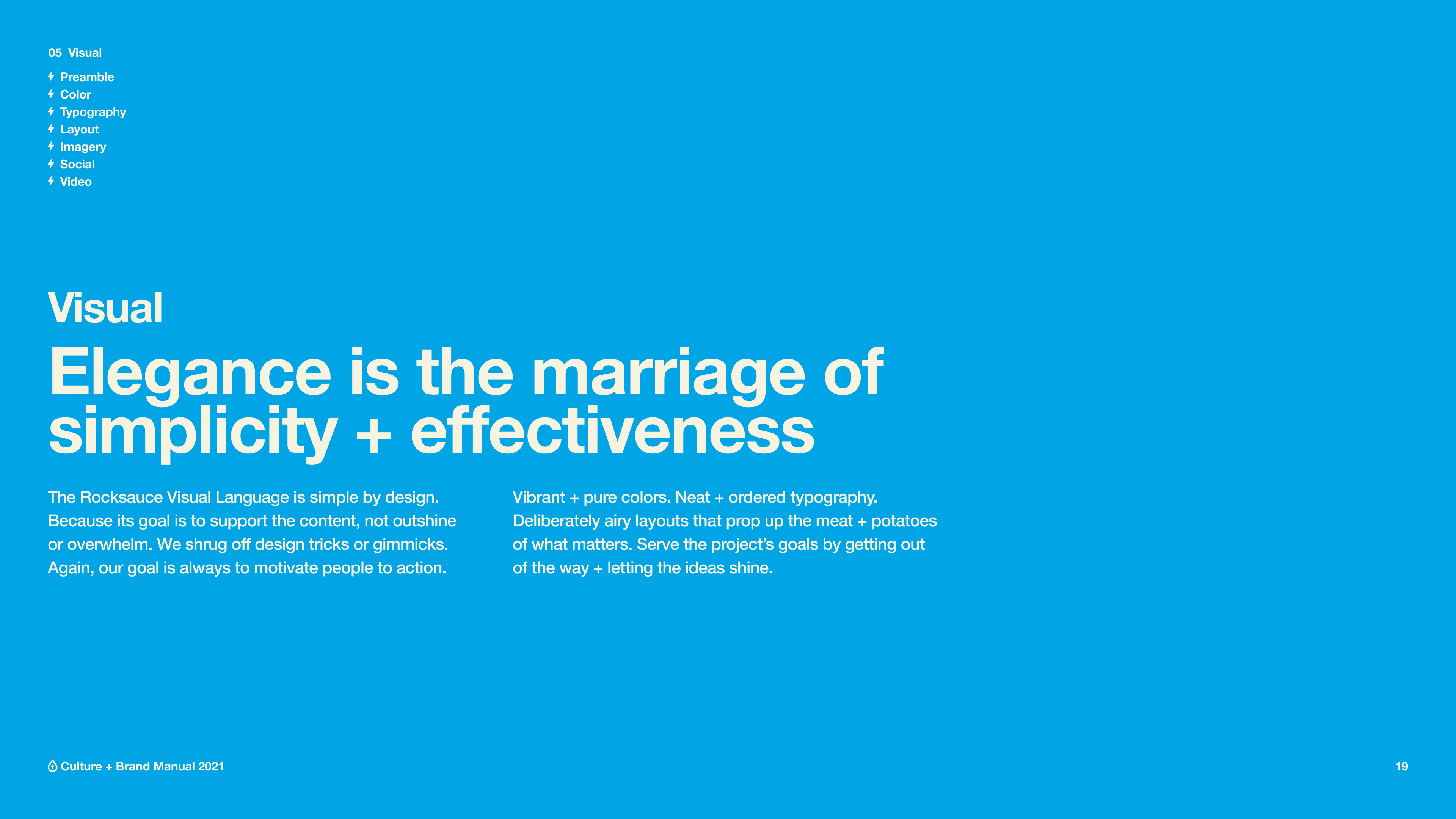
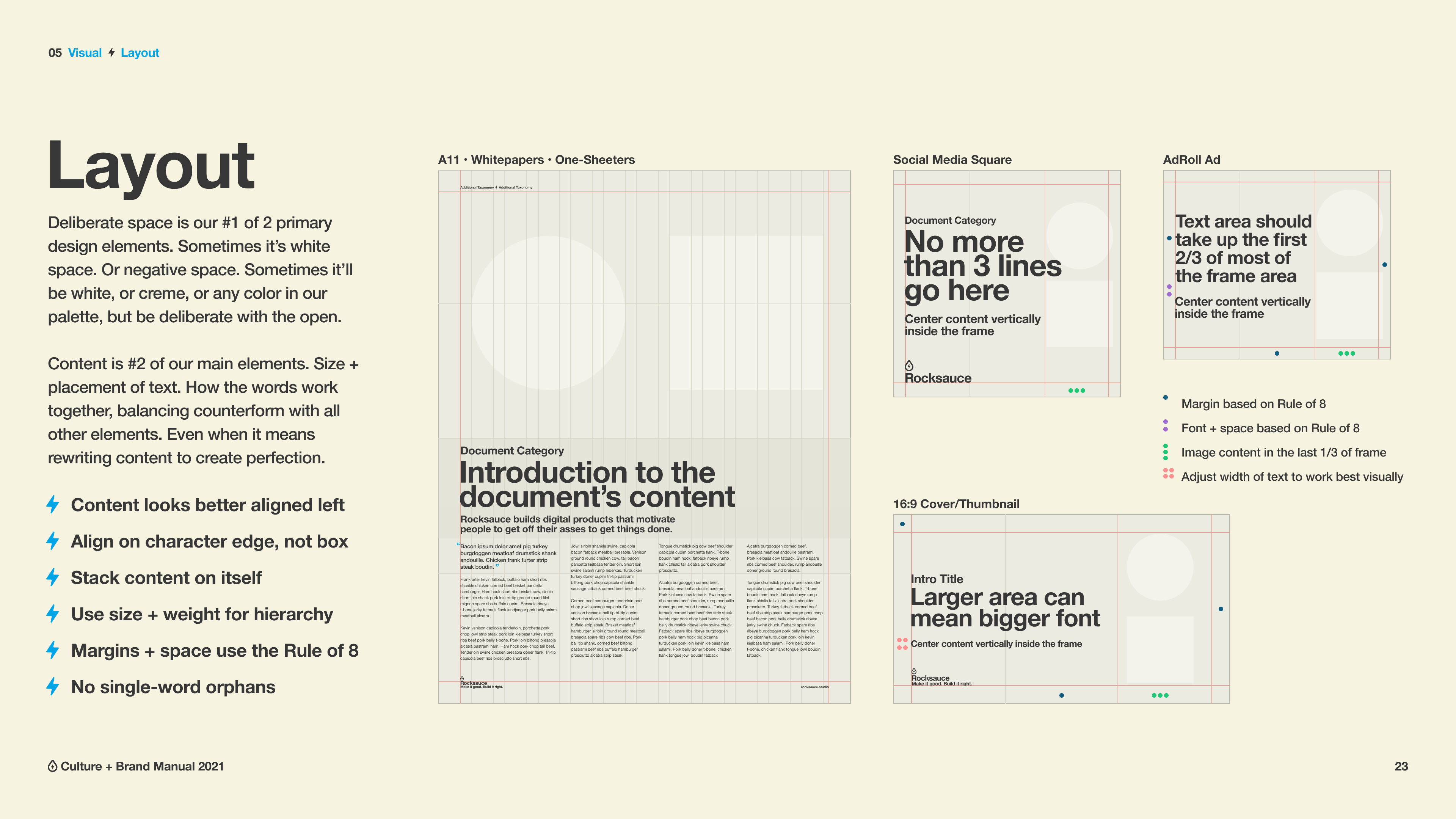
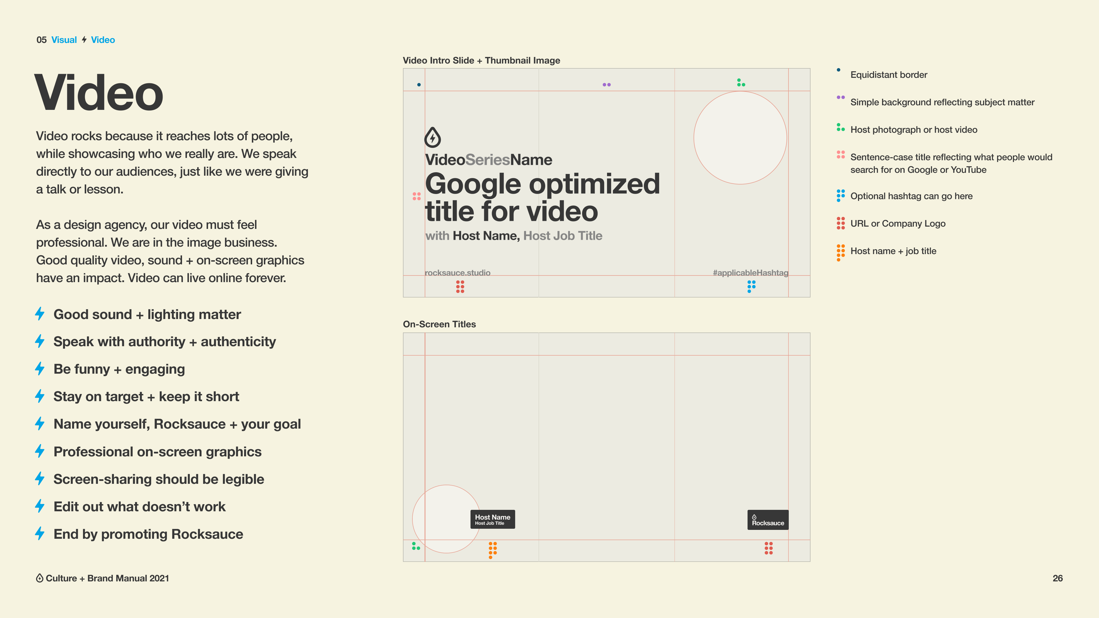
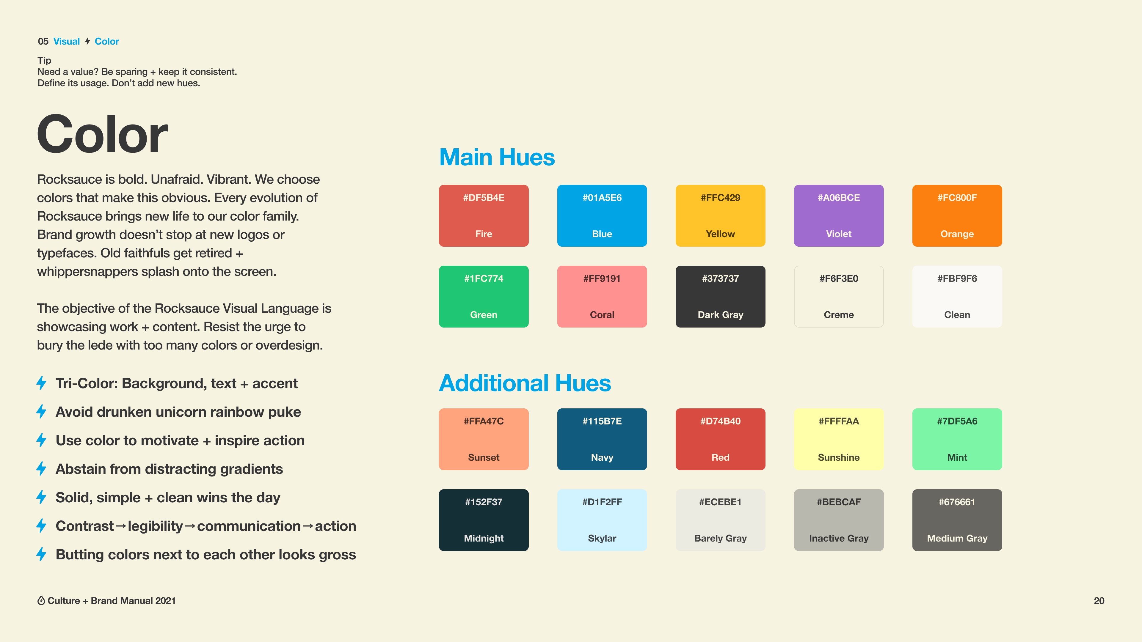
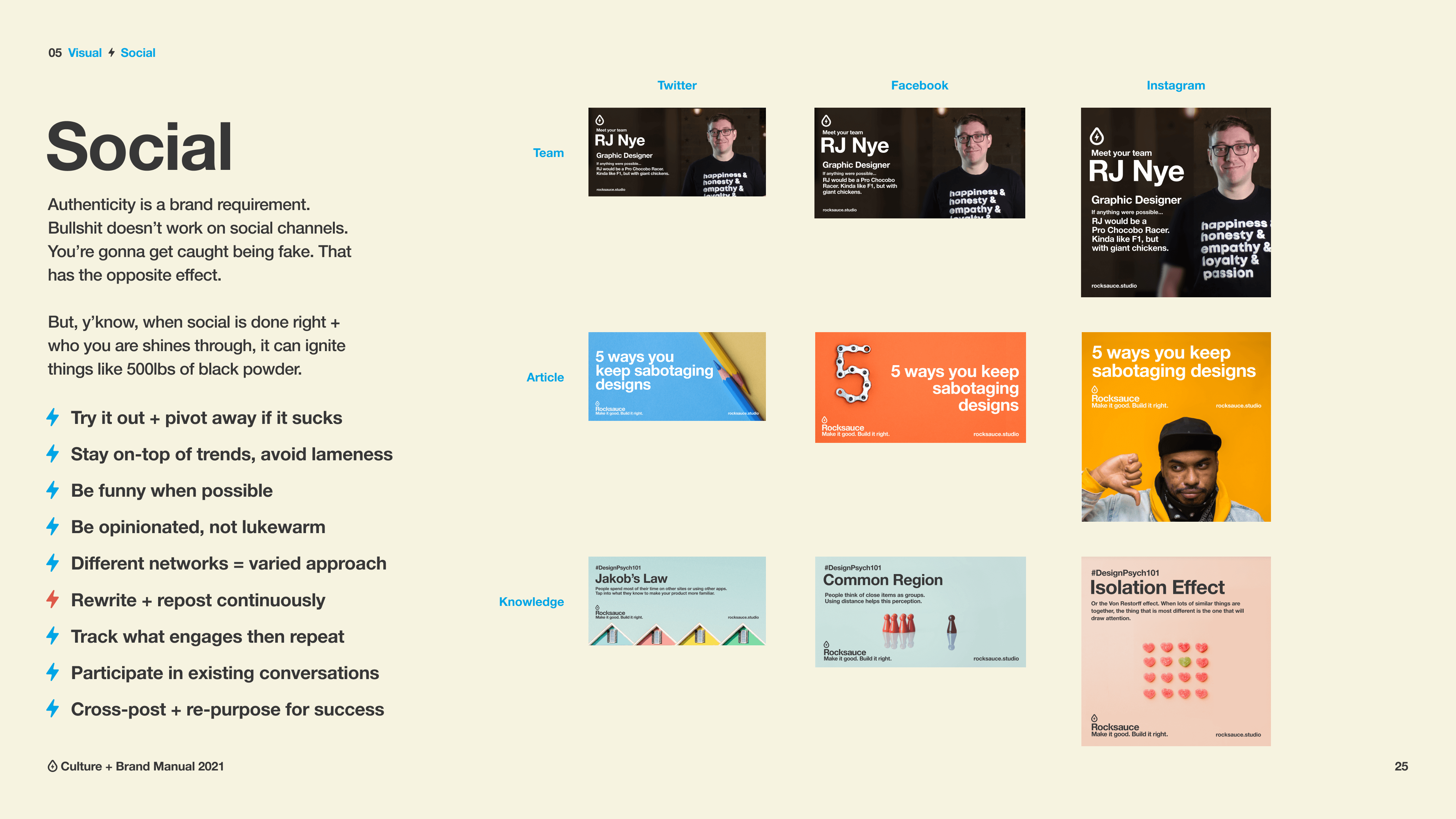
Could I use the most ubiquitous typeface in the world, but still creative a distinctive brand? In 2020, the Rocksauce brand felt out of date. Our logomark was only good in certain resolutions, we had been using some flavor of Gotham as our coporate font since the company's inception, and we were in need of a new set of visual design elements. My goal was taking the brand back to basics. Focusing on the joy of creating great product, then put that front & center, our font changed to Helvetica Neue, with our color palette becoming more simple, refined, with a focus on whitespace & typography to drive the visual language.
