William Ryan Homes
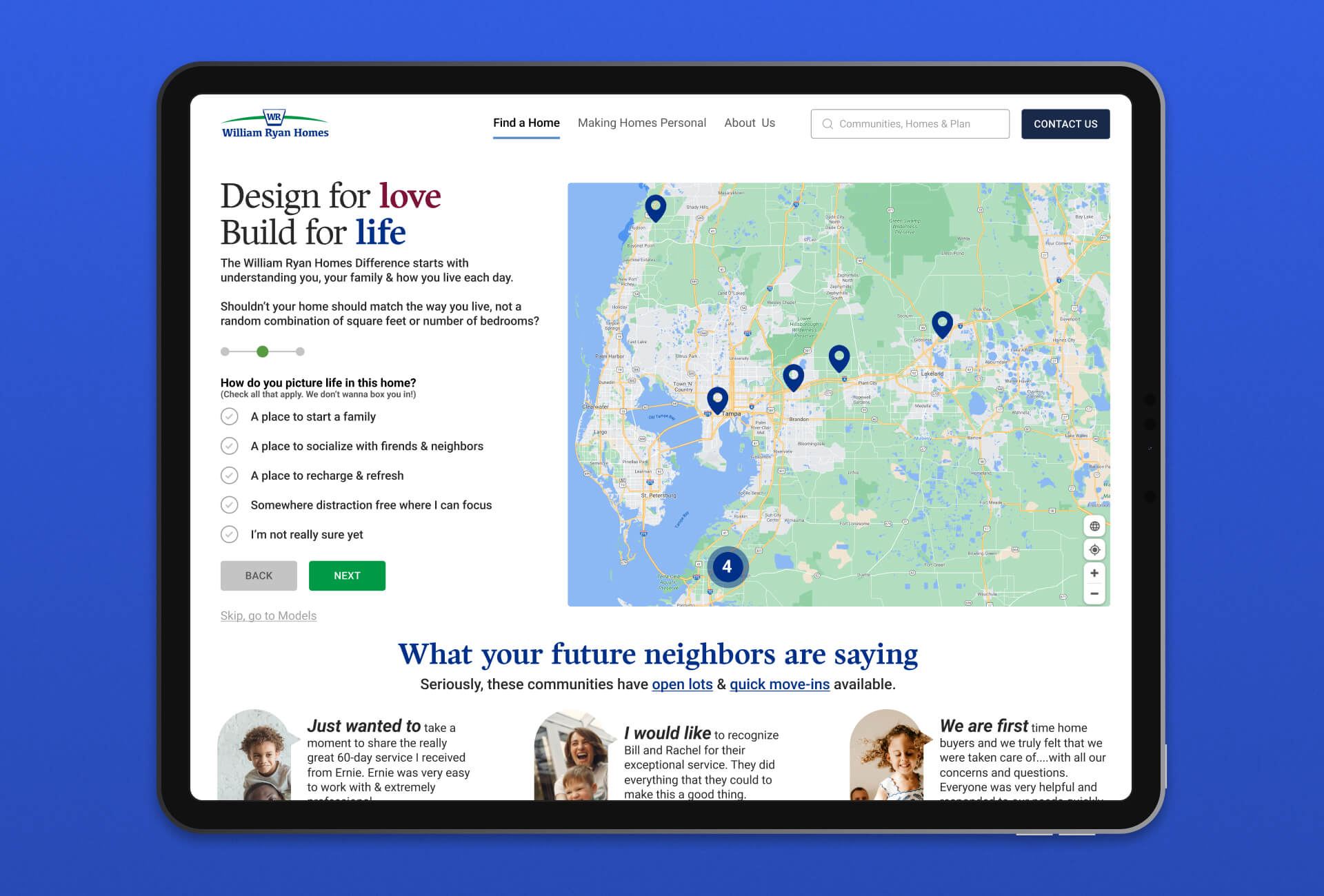
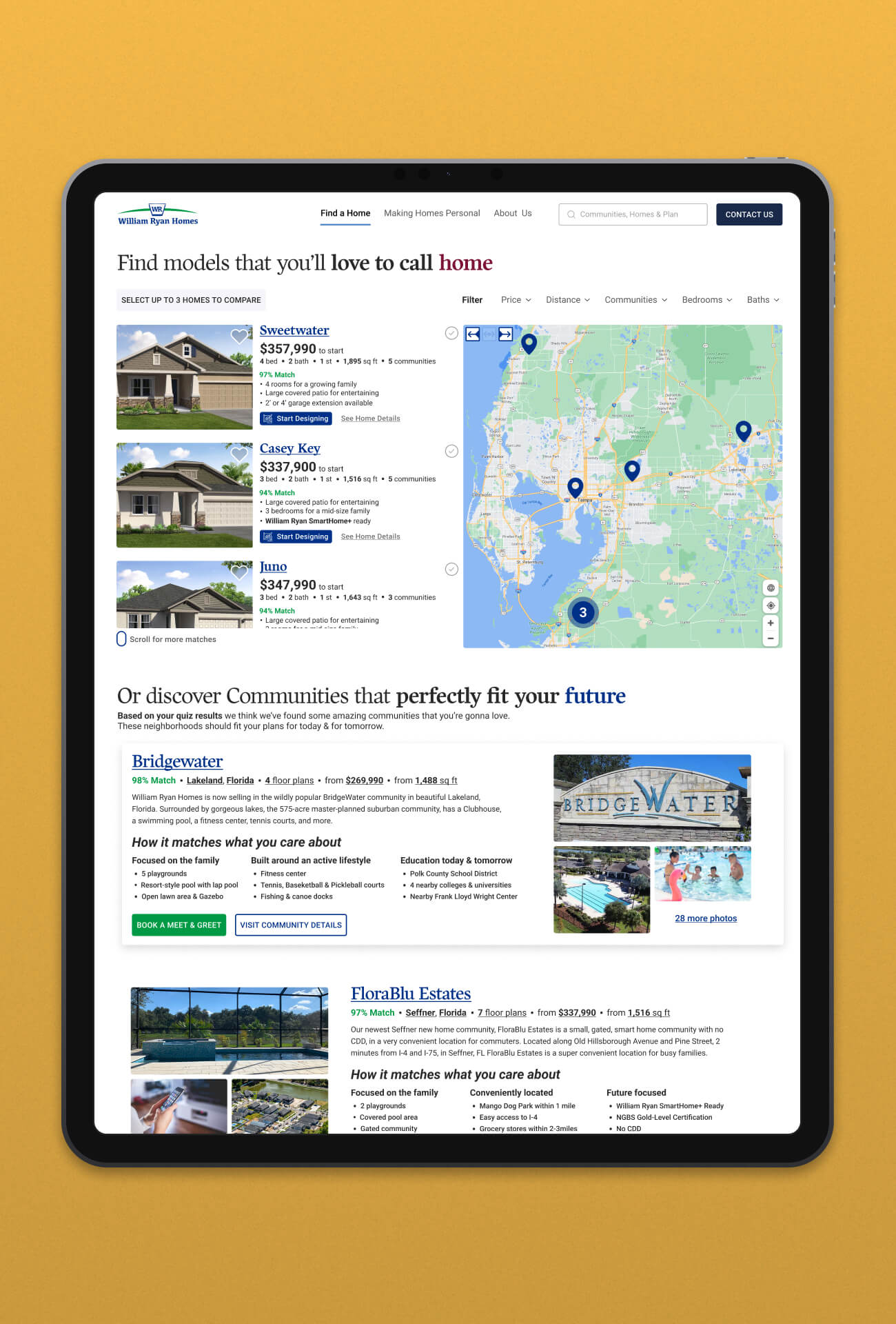
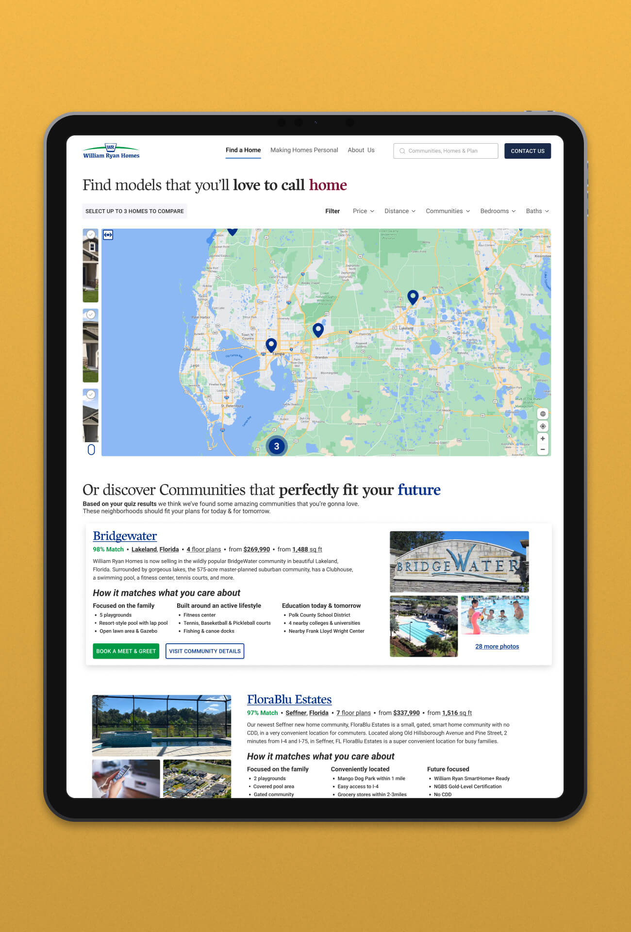
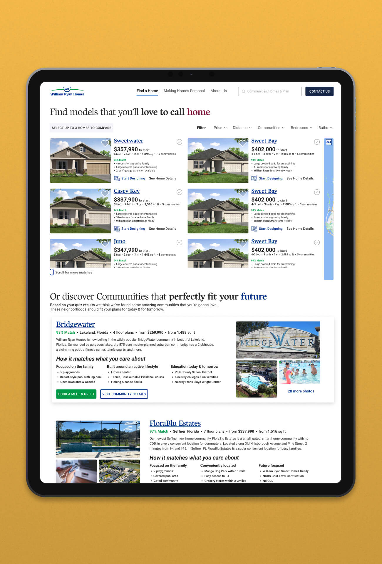
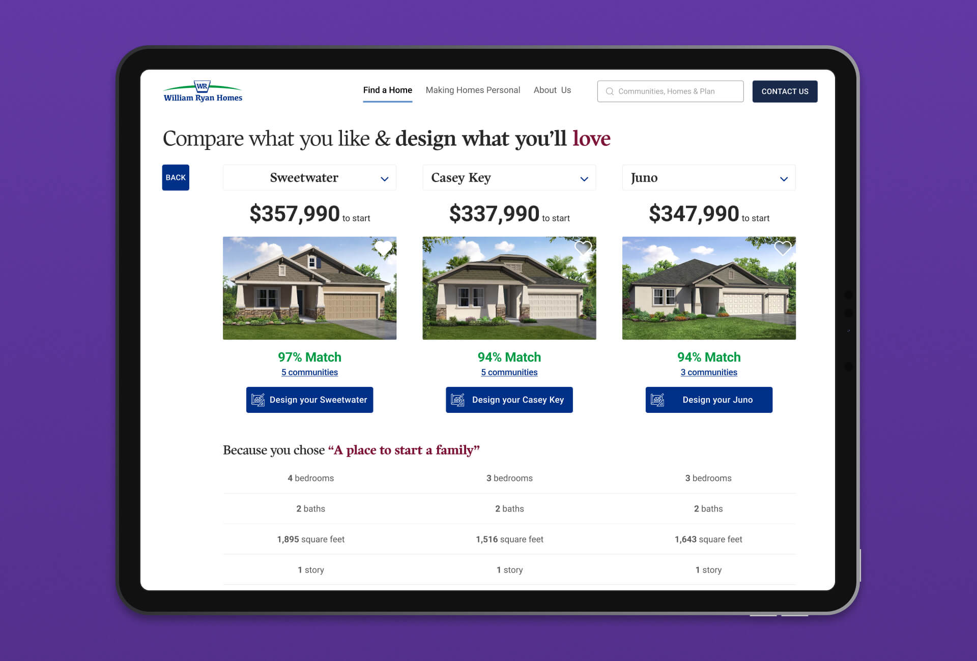
Our relationship with the amazing team at William Ryan Homes was entering its third-year. A redesign of their corporate website was needed, but the big fun was figuring out how to let people buy homes right through the website. I lead the team in a Design Sprint, where two ideas were created. The first was a simpler, less interactive concept that fit the current tech stacks. We also had ideas for a more engaging, delightful process of guiding people. My team took lead on the present-tech capable rendition, while I opened up Figma to show a future-vision where we let the experience drive the technology.
